Hello friends, today we will be going to how do we Create a Read More Read Less Button using Javascript Multiple Boxes with Read more function. I have posted many videos and articles before related to the JavaScript project, now this the something new that we are going to build.
Video Tutorial of How To Create a Read More Read Less Button using Javascript Multiple Boxes with Read more function
As you have seen on the given video tutorial of How To Create a Read More Read Less Button using Javascript Multiple Boxes with Read more function,
If you are feeling bored watching the given video tutorial of How To Create a Read More Read Less Button using Javascript Multiple Boxes with Read more function then you can copy or download the given codes below:
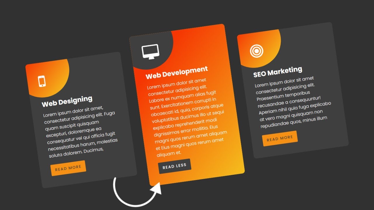
How To Create a Read More Read Less Button using Javascript Multiple Boxes with Read more function | Free Source Code
To create this program (Read More Read Less Button). First, you need to create two Files one HTML File and another one is CSS File. After creating these files just paste the following codes in your file.
In the first place, make a HTML document with the name of index.html and glue the given codes in your HTML record. Keep in mind, you've to make a document with .html extension.
<!DOCTYPE html>
<html lang="en">
<head>
    <meta charset="UTF-8">
    <meta name="viewport" content="width=device-width, initial-scale=1.0">
    <link rel="stylesheet" href="https://cdnjs.cloudflare.com/ajax/libs/font-awesome/4.7.0/css/font-awesome.css" integrity="sha512-5A8nwdMOWrSz20fDsjczgUidUBR8liPYU+WymTZP1lmY9G6Oc7HlZv156XqnsgNUzTyMefFTcsFH/tnJE/+xBg==" crossorigin="anonymous" referrerpolicy="no-referrer" />
    <link rel="stylesheet" href="style.css">
    <title>Creative Card Hover Effect and Read More Function</title>
    <!-- Created by S-Tech04 -->
</head>
<body>
    <div class="container">
        <div class="card">
            <div class="icon">
                <i class="fa fa-mobile" aria-hidden="true"></i>
            </div>
            <div class="content">
                <h3>Web Designing</h3>
                <p>Lorem ipsum dolor sit amet, consectetur adipisicing elit. Fuga quam suscipit quisquam excepturi, doloremque ea consequatur vel qui officia fugit necessitatibus harum, molestias soluta dolorem. Ducimus, maiores! Officiis, consequuntur! Aspernatur veritatis inventore aut possimus tenetur sint hic perferendis accusamus consequuntur!</p>
            </div>
            <a class="more"></a>
        </div>
        <div class="card">
            <div class="icon">
                <i class="fa fa-desktop" aria-hidden="true"></i>
            </div>
            <div class="content">
                <h3>Web Development</h3>
                <p>Lorem ipsum dolor sit amet consectetur adipisicing elit. Labore ex numquam alias fugit sunt. Exercitationem corrupti in obcaecati id, quia, corporis atque voluptatibus ducimus illo ut sequi explicabo reprehenderit modi dignissimos error mollitia. Eius magni quos rerum amet aliquam et Eius magni quos rerum amet aliquam et.</p>
            </div>
            <a class="more"></a>
        </div>
        <div class="card">
            <div class="icon">
                <i class="fa fa-bullseye" aria-hidden="true"></i>
            </div>
            <div class="content">
                <h3>SEO Marketing</h3>
                <p>Lorem ipsum dolor sit amet consectetur adipisicing elit. Praesentium temporibus recusandae a consequuntur! Aperiam nihil quia fuga explicabo at vero magni quisquam non repudiandae quos, minus illum fugit sunt odit excepturi aut. Libero voluptate, facilis placeat accusamus eius blanditiis veritatis unde nisi impedit, sint minima?</p>
            </div>
            <a class="more"></a>
        </div>
    </div>
    <script>
        const more = document.querySelectorAll('.more')
        for(let i = 0; i<more.length; i++){
            more[i].addEventListener('click', ()=>{
                more[i].parentNode.classList.toggle('active')
            })
        }
    </script>
</body>
</html>
Second, make a CSS record with the name of style.css and glue the given codes in your CSS document. Keep in mind, you've to make a record with .css extension.
@import url('https://fonts.googleapis.com/css2?family=Poppins:wght@100;200;300;400;500;700;900&display=swap');
*
{
  margin: 0;
  padding: 0;
  box-sizing: border-box;
  font-family: 'Poppins',sans-serif;
}
body
{
  display: flex;
  justify-content: center;
  align-items: center;
  min-height: 100vh;
  background: #313131;
}
.container
{
  position: relative;
  display: flex;
  justify-content: center;
  align-items: center;
  flex-wrap: wrap;
  width: 1200px;
}
.container .card
{
  position: relative;
  width: 350px;
  padding: 40px;
  margin: 20px;
  background: #3f3f3f;
  border-radius: 10px;
  overflow: hidden;
  z-index: 1;
}
.container .card::after
{
  content: '';
  position: absolute;
  top: -72px;
  left: -42px;
  width: 200px;
  height: 200px;
  background-color: #f5d020;
  background-image: linear-gradient(315deg, #f5d020 0%, #f53503 75%);
  transition: cubic-bezier(0.39, 0.58, 0.57, 1) all 0.15s;
  z-index: -2;
  border-radius: 50%;
}
.container .card::before
{
  content: '';
  position: absolute;
  top: -200px;
  left: -200px;
  width: 200px;
  height: 200px;
  background-color: #3f3f3f;
  transition: cubic-bezier(0.39, 0.58, 0.57, 1) all 0.55s;
  z-index: -1;
  border-radius: 50%;
}

.container .card:hover::after,
.container .card.active::after
{
  width: 120%;
  height: 120%;
  border-radius: 0;
  top: -10%;
  left: -10%;
  transition: cubic-bezier(0.39, 0.58, 0.57, 1) all 0.55s;
}
.container .card:hover::before,
.container .card.active::before
{
  top: -72px;
  left: -42px;
}
.container .icon
{
  margin-bottom: 10px;
}
.container .icon .fa
{
  font-size: 3.5em;
  color: #fff;
}
.container .content
{
  margin-top: 40px;
  height: 225px;
  overflow: hidden;
}
.card.active .content
{
  height: auto;
  overflow: auto;
}
.container .content h3
{
  font-size: 24px;
  color: #fff;
  font-weight: 700;
  margin-bottom: 10px;
}
.container .content p
{
  font-size: 16px;
  color: #fff;
  font-weight: 300;
}
.card .more
{
  position: relative;
  display: inline-block;
  padding: 10px 15px;
  color: #383838;
  background: #f59014;
  border-radius: 3px;
  cursor: pointer;
  text-transform: uppercase;
  font-size: 14px;
  font-weight: 500;
  margin-top: 15px;
  letter-spacing: 2px;
  transition: cubic-bezier(0.39, 0.58, 0.57, 1) all 0.55s;
}
.container .card:hover .more,
.container .card.active .more
{
  background: #3f3f3f;
  color: #fff;
}
.container .card.active .more::before
{
  content: 'Read Less';
}
.container .card .more::before
{
  content: 'Read More';
}
That’s all, now you’ve successfully created a program to How To Create a Read More Read Less Button using Javascript Multiple Boxes with Read more function. If your code doesn’t work or you’ve faced any error/problem, please download the source code files from the given download button. It’s free and a .zip file will be downloaded then you’ve to extract it.
Click on the following download button to download all source code files.
Post a Comment
How can I help you