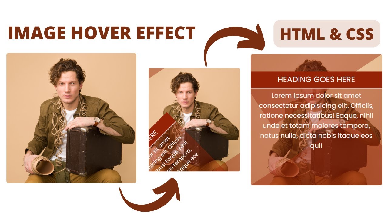
Hello friends today in this blog, you’ll learn to create image hover effect using HTML & CSS. Image hover effect is an excellent way to create more interactive and detailed experience. By its name, it helps users to reveal an important element on the page. It’s helpful for navigating pages or revealing menus. In this tutorial, we will show you how to create image hover effect using HTML and CSS.
I have posted many videos and articles before related to the JavaScript project, how this the something new that we are going to build.
Video Tutorial of How to create Image hover effect Using Html & CSS
As you have seen on the given video tutorial of image hover effect using HTML & CSS,
If you are feeling bored watching the given video tutorial of image hover effect then you can copy or download the given codes below:
Image hover effect Using Html & CSS | Free Source Code
To create this program (Image hover effect). First, you need to create two Files one HTML File and another one is CSS File. After creating these files just paste the following codes in your file.
In the first place, make a HTML document with the name of index.html and glue the given codes in your HTML record. Keep in mind, you've to make a document with .html extension.
<!DOCTYPE html>
<html lang="en">
<head>
    <meta charset="UTF-8">
    <meta http-equiv="X-UA-Compatible" content="IE=edge">
    <meta name="viewport" content="width=device-width, initial-scale=1.0">
    <link rel="stylesheet" href="style.css">
    <title>Card Hover Effect</title>
</head>
<body>
    <div class="box">
        <div class="imgBx">
            <img src="./img.jpg" alt="">
        </div>
        <div class="content">
            <h3>Heading Goes Here</h3>
            <p>Lorem ipsum dolor sit amet consectetur adipisicing elit. Officiis, ratione necessitatibus! Eaque, nihil unde et totam maiores tempora, natus nulla, dicta nobis itaque eos qui!</p>
        </div>
    </div>
</body>
</html>@import url(https://fonts.googleapis.com/css?family=Poppins:100,100italic,200,200italic,300,300italic,regular,italic,500,500italic,600,600italic,700,700italic,800,800italic,900,900italic);
*{
margin: 0;
padding: 0;
box-sizing: border-box;
font-family: "Poppins",sans-serif;
}
body{
display: flex;
align-items: center;
justify-content: center;
min-height: 100vh;
}
.box{
width: 300px;
height: 300px;
overflow: hidden;
position: relative;
border-radius: 5px;
}
.box::before,
.box::after{
content: '';
position: absolute;
background: #9723076b;
z-index: 1;
width: 100%;
height: 100%;
opacity: 0;
transition: 0.3s;
}
.box::before{
left: auto;
right: 0;
top: 0;
transform-origin: 100% 0;
transform: rotate(56.6deg) translateX(-40%);
}
.box::after{
top: auto;
bottom: 0;
left: 0;
transform-origin: 0 100%;
transform: rotate(56.6deg) translateX(40%);
}
.box:hover::before{
opacity: 1;
transform: rotate(56.6deg) translateX(0%);
}
.box:hover::after{
opacity: 1;
transform: rotate(56.6deg) translateX(0%);
}
.box .imgBx img{
position: absolute;
width: 100%;
height: 100%;
object-fit: cover;
}
.box .content{
position: absolute;
top: 40px;
width: 100%;
height: 100%;
background: #9723076b;
transform-origin: bottom right;
transform: rotate(-45deg);
opacity: 0;
transition: 0.3s all;
z-index: 2;
}
.box .content h3{
font-size: 18px;
font-weight: 400;
background: #972307;
color: #fff;
text-transform: uppercase;
padding: 5px 10px;
text-align: center;
border-bottom: 2px solid rgba(255,255,255,0.82);
}
.box .content p{
font-size: 15px;
padding: 5px 15px;
text-align: center;
color: #fff;
font-weight: 400;
}
.box:hover .content{
opacity: 1;
transform: rotate(0deg);
}That’s all, now you’ve successfully created image hover effect Using Html, CSS and JavaScript. If your code doesn’t work or you’ve faced any error/problem, please download the source code files from the given download button. It’s free and a .zip file will be downloaded then you’ve to extract it.
Click on the following download button to download all source code files.


Post a Comment
How can I help you